
The original "killer app" for personal computers was an Apple II program called VisiCalc, written in 1978 by Dan Bricklin and Bob Frankston. VisiCalc made it possible to use a computer for the kind of analyses that generations of business people had previously done by hand with paper "spreadsheets": rows and columns of related numbers that could be used to organize data and assess alternatives in a systematic way.
Today, spreadsheets are the quantitative reasoning tool for many people. In terms of market share, Microsoft's Excel is the de facto standard, with Lotus 1-2-3 (the lineal descendant of VisiCalc) and Corel's Quattro Pro distant second and third choices. All of these programs share a common computational model and visual appearance, however, and although we will use Excel in this lab, whatever you see will transfer in spirit, though not in exact detail, to the others.
Excel is enormously powerful and complicated, so we will investigate only a tiny fraction of its features. As you work through the specific instructions in this lab, take time to leave the official track and experiment on your own with anything that looks interesting. There's little risk in this: Excel's Undo and Redo feature let you back out of something that went wrong, or repeat the steps that got you someplace interesting. Undo and Redo are the small curved arrows near the middle of this screenshot:
If you want to know more about Excel, there are many hundreds of books, some good, and many web pages. The party line is found at Microsoft's Excel site, while John Walkenbach's spreadsheet page provides independent material from the author of several good books.
Part 1: Cells and Formulas
Part 2: Ranges and Functions
Part 3: Importing and Graphing Data
Part 4: How to Lie with Statistics (1)
Part 5: How to Lie with Statistics (2)
Part 6: Submitting your work
Part 1: Cells and Formulas
- Starting Excel
- Basic Concepts
- Formulas
- The Rule of 72
Starting Excel
Take some time now to explore the menus, toolbars, and the like.
Basic Concepts
(work)sheet, which consists of an array of rows numbered 1 through 65536 (where does that number come from?) and columns labeled A, B, C, ..., through IV (where does that label come from?). Near the bottom of the Excel window you will see a tab labeled Sheet1, which is Excel's default name for the first sheet. A workbook is a collection of one or more sheets, a useful way to group related data sets in a single file but keep them cleanly separated. The default workbook name is Book1, which appears in the title bar of the window. You're going to put the results of various parts of this lab into multiple sheets, so pay attention to where things are going.The individual elements of a spreadsheet are called cells. A cell is identified by its row and column; thus the cell in the upper left corner (highlighted when you started Excel) is named A1. The highlighted cell is called the active cell.
Cells can contain numbers (the most common case) or text, and their values can be set by what you type into them, loaded from files, or computed by a formula that derives a value from the values of other cells.
Time to do some experimenting.
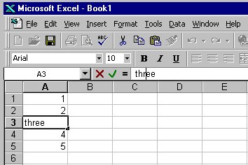
- Type some numbers into cells: put 1 in A1, 2 in A2, etc., down to 5 in A5.
- If you start at A1, then push Enter after each value, Excel will advance the active cell to the next row automatically.
- Experiment with correcting typing errors, going back to change a previous value, and so on.
You can fix mistakes by retyping, or you can edit in the small editing window
just above the column labels:
You can change the format of cell data by "Format | Cells", and then select "Number" to set the numeric display, "Alignment" to control centering, "Font" to set size and color, and so on. The most common reason to adjust cell format is to cause data to be treated as numeric and displayed with the same number of significant digits, or to define the format for data that represent dates. You can instead put text in cells to serve as headings for columns or rows; text can be set in various sizes and fonts as well.
You can use commands under "Edit" to clear cell contents entirely. In all of these, you can select a single cell, a group of cells, one or more entire rows, or one or more entire columns; the action applies to the selected range.
To insert an additional row or column, use the "Insert" menu.
Formulas
A formula is typed into a cell just like data except that the first character must be an equals sign =. To experiment with this:- Make sure cells A1 through A5 contain the digits 1 through 5.
- Go to cell A7 and type =A1+A2+A3+A4+A5 and push Enter. (You can type in lower case if you prefer; Excel will capitalize automatically.) If this doesn't cause cell A7 to display the value 15, check your typing.
- Now experiment with changing values in cells A1 through A5, verifying each time that the sum in A7 is properly updated.
A further experiment:
- Type the formulas =A1*A1 in cell B1, =A2*A2 in cell B2, and so on through B5. Verify that the computed values are correct.
- Place the corresponding summation formula in B7 and verify that it produces the right answer.
It takes a lot of typing to enter data values and formulas this way, so Excel provides some convenient shortcuts.
- Clear all the cells that you have used so far.
- Put 1 in A1 and 2 in A2.
- Select A1 and A2.
- Place the mouse on the lower right corner of A2; the cursor should change to a plus sign.
- Drag the plus sign down the column to row 30 or so and release it.
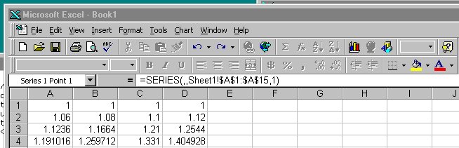
- Type the formula =A1*A1 in cell B1.
- Using the same technique, extend the series to cell B30 and verify that the values are right.
Finally,
- Type the formula =2^A1 in cell C1.
- Extend this series down to cell C40.
- If you narrow the column, the numbers will change format, likely twice. What's happening?
- Suppose you start with the value 2 in cell D1. What different (not the same as in C2) formula could you put in D2 and then extend to D40 that would provide the same sequence of values in D1:D40 as in C1:C40?
As discussed in class, Excel, like Word, uses Visual Basic as a scripting language. All of Excel's myriad capabilities (including anything you can do with keyboard and mouse) are accessible as "objects" in the programming sense from VB code. This can be used to organize much more complicated computation than would be feasible with simple formulas in cells, to tailor the interface for specific purposes, and to access all of the repertoire of other components on Windows. And of course the bad news is that spreadsheets can be just as much carriers of VB-based viruses as Word documents, so you should run Excel with macros disabled by default.
We won't pursue any of this further, but if you want to explore, VB is waiting for you: Tools / Macro / VB Editor.... One of the neatest things here is that you can turn on the "macro recorder"; this will record whatever subsequent actions you perform and convert them into the equivalent VB code. It's a very effective learning tool and a valuable complement to the manual.
The Rule of 72
The rule of 72 tells you how to estimate the doubling time approximately: divide 72 by the interest rate, and that's the number of periods. So at 10% per year, the doubling time is about 7.2 years. If the interest rate is only 6%, the doubling time is about 12 years. Of course, you can turn it around: divide 72 by the number of periods and it gives the interest rate. Consider Moore's Law, that the capacity of semiconductor chips doubles every 18 months. By the Rule of 72, we see that capacity is compounding at about 72/18 = 4% per month.The approximation isn't perfect, but it's pretty accurate for the kinds of percentages found in daily life for home mortgage interest rates, bond interest, car payments, and so on.
Your task is to make a spreadsheet that shows how good the approximation is for a variety of interest rates.
- Clear the contents of Sheet1.
- Create a table with a heading row B1:L1 that contains the rate in percent from 5 to 15.
- Put the year number in A3:A23, from 0 to 20 inclusive.
- Into the range B3:L23 put the compounded values, beginning with year 0. The formula for compound interest is value = (1+rate)^years.
- Set a yellow background color in the cell in each column where the initial value is closest to having doubled.
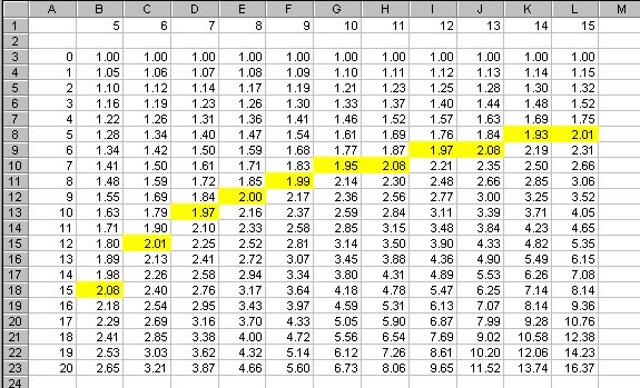
The rule shows further doublings as well; for instance, note that at 8%, one doubling takes 9 years, and the next takes another 9 years -- that is, 18 years doubles twice, or a factor of four. Check some of the other entries for similar consistency.
In this lab, you will be using a new sheet for each part, each with its own name. For this part,
- Double-click on the tab that says Sheet1.
- Type the name Rule72 in its place.
- Insert a comment (not a cell value) in cell A1 that answers the two questions at the end of the previous section.
- Save the spreadsheet in a file called lab8.xls. You'll be updating it throughout the labs, so be sure to save regularly.
Part 2: Ranges and Functions
- Ranges
- Functions
- Inserting Rows and Columns
Ranges
=A1+A2+A3, or implicitly by letting Excel extend a series for us. It's also possible to specify a rectangular array of cells in terms of the cells at the upper left and lower right corners. Such an array is called a range, and is usually written with the names of the two cells separated by a colon.For example, A1:A10 describes a column range 10 cells high but only one cell wide. The range B2:K2 represents a row of 10 cells starting at B2, and A1:J10 represents an array of 100 cells, 10 by 10, that starts in the upper left corner. As a special case, A2:A2 is a range that consists of a single cell, and that can be abbreviated to just the familiar A2.
Excel provides more complicated ranges, but for the most part, simple rectangular arrays are all we need. It is also possible to name a range, which is easier to understand and refer to in a big spreadsheet; we won't be using that facility here.
Functions
The range notation gives us a way to specify an arbitrarily large group of cells, and thus write out computations much more compactly and clearly. For instance, it's impractical to type a formula like =A1+A2+A3+... if there are more than a few terms in the summation; a range is a lot easier.Excel provides a great number of mathematical functions that perform operations over a range of cells. The simplest of these is sum, which adds up the numbers in a range: the formula =SUM(range) produces the sum of the values in the cells in the specified range.
Among the other useful functions are average,
median, product, max (which
computes the maximum value in a range), min, and
count, which counts the number of non-blank cells in the range.
Inserting Rows and Columns
What happens if you need another row or column, because your data set has expanded? If you insert a row or a column within a range, Excel is pretty clever about guessing what you mean, and will extend the formula for you. But if you add a row or column at one end of the range, Excel isn't sure what you had in mind, and doesn't change the formula. Verify this behavior:- Put the numbers 1..10 in cells A1 through A10.
- Put the formula =SUM(A1:A10) in cell A12.
- Now insert a new row 10 and put the value 100 in it. Note that the sum is now displayed in A13 instead of A12. Does the value in A13 change? Does the formula in A13 change?
- Continue the experiment by inserting a new row before row 1, and a new row after the last row of data. Check what happens to the data and the formula.
Part 3: Importing and Graphing Data
- Importing Data From Files
- Graphing Data
Importing Data From Files
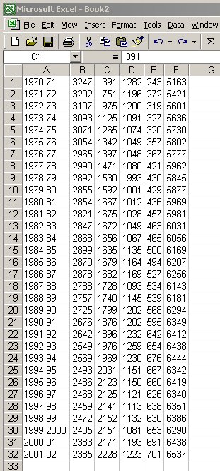
Registrar's web site, which contains, among other things, Princeton enrollments for many years.The first step is to import a file of data extracted from one of these pages; we've cleaned it up a bit for you. The file reg.txt contains registration data for 1970 through 1999 as ordinary text. It begins like this:
                       PRINCETON UNIVERSITY OPENING ENROLLMENT
                                     1970-Present
   Academic     Undergraduate     Undergraduate    Graduate   Graduate      Total
     Year           Males            Females        Males      Females    Enrollment
 1970-71                  3247               391       1282         243         5163
 1971-72                  3202               751       1196         272         5421
 1972-73                  3107               975       1200         319         5601
 ...
- Import this file into your spreadsheet and edit it so it looks like this:
This is most easily done by
- Save reg.txt locally.
- In Excel, go to Sheet2.
- Select Data / Get External Data / Import Text File...
- Discard the headings.
- Let the wizard guide you through identifying the data columns. (Most of its choices are correct for this data set, though you may need to experiment with column widths.)
The next step is to insert a new column D that contains the
total undergraduate population for each year.
Since you will be adding other data to the spreadsheet, rename Sheet2 to Grads:
- Double-click the tab labeled Sheet2.
- Type the name Grads in its place.
Graphing Data
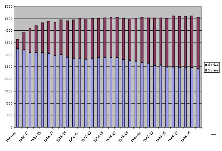
- Use the chart wizard
("Insert | Chart" or this icon
 )
to create a graph that looks approximately
like the one above but with proper labels, etc., and place it on sheet Grads.
)
to create a graph that looks approximately
like the one above but with proper labels, etc., and place it on sheet Grads.
- Use the chart wizard to create another graph that is as different from the previous one as you can manage while still displaying the same information in a form that can potentially be understood. Place it on sheet Grads, near the other chart.
- Make the two charts approximately the same size and together about the same height as the data, so everything can be seen at once.
Part 4: How to Lie with Statistics (1)
Gee-Whiz Graphs
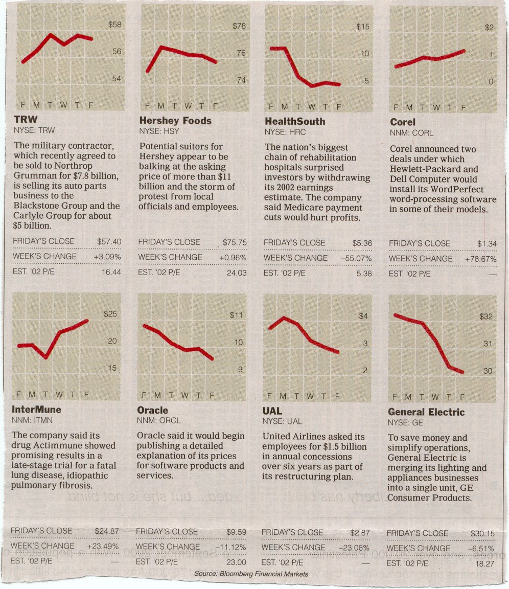
Or did they? These are examples of what Darrell Huff, in the wonderful book How to Lie with Statistics, calls the Gee-Whiz Graph, a form of statistical chicanery that is all too common in newspapers and magazines.
Gee-whiz graphs are deceptive because they use the entire chart area to give the impression of a big change. This gives entirely the wrong impression when not much is happening and it makes comparisons quite misleading. Consider TRW versus Corel. TRW seems to have risen a bit more than Corel, at least graphically, but in fact their fortunes were enormously different: TRW rose a modest 3%, while Corel went up by 78%! Similarly, one could easily conclude that GE went down more than HealthSouth, but in fact, the declines are 6.5% and 55%.
The heart of the deception is plotting a graph that doesn't include the full range of data. Each graph should be plotted with the Y axis beginning at zero; that would give a much more accurate sense of the magnitude of the change. And then if each is plotted with a comparable upper bound, somewhat above the largest data value, that makes it possible to compare the two graphs in a meaningful way.
Your task is to produce two sensible graphs that permit such a fair comparison, by having the Y axis start at 0 and the values just about fill the vertical range, like this graph of the Corel data:
Note that the data in these text files is in the wrong order; use Excel's sorting capabilities (e.g., Data | Sort...) to get it into the right order.
- Go to Sheet 3 and rename it Lies
- Load the date and closing-price data from hrc.txt into A1:B22 of sheet Lies. Cut and paste is easiest.
- Draw a graph approximately like the one above, but with the Y origin set to zero.
- Load the data from ge.txt into C1:C22 of sheet Lies.
- Draw a graph like the one above, with Y origin set to zero.
- Position the graphs side by side and near the 3 data columns.
Part 5: How to Lie with Statistics (2)
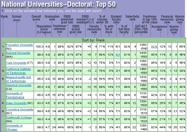
It's always nice when others recognize one's true greatness, as US News and World Report did in September 2000 and again in 2001 and 2002. But how are these rankings really determined? And just how much do they really mean?
US News explains their methodology. They collect data on a variety of factors for each school, weight the factors according to how important they seem, and then sort the results. For example, reputation used to account for 25% of the score, and alumni giving rate for 5%; Princeton ties with four other top schools on the former and wins big on the latter. On the other hand, if only SAT scores mattered, Princeton would be well behind Caltech, Harvard, MIT, and even Yale and Stanford. (The details change from year to year, and US News has become more circumspect about revealing them this time.)
There are two problems with these ranking schemes: the data itself is suspect, and the weighting factors are arbitrary. In this lab, we'll accept the data values, however flaky they might be, and focus on the weighting factors.
The file usnwr.xls contains some carefully fiddled data and a set of weights, loosely based on the data from 2001, that preserve the same ordering; many factors have been unceremoniously dropped, so don't read too much into this. Here is the display:
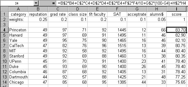
The first row shows the factors, and the second row gives weights that sum to 1 (cell I2). The range I4:I14 shows the computed scores. The formula box shows the formula being used to compute I4; subsequent rows have the same formula except for cell references. A couple of factors are scaled (SAT) or complemented (acceptance rate); for instance a low acceptance rate is deemed better than a high acceptance rate.
Your task is to find several sets of non-negative weights that will rearrange the schools in various ways. Note that the weights in B2:H2 must sum to 1.
- Download file usnwr.xls from the browser and open it in Excel. (It will appear in a new workbook.)
- Select and Copy all its cells.
- Go to Book1.
- Insert a new Sheet, and rename it Rank.
- Select cell A1 and Paste.
- Find a set of weights that drops Harvard as far down as you can while keeping Princeton in first place. Copy the weights into B17:H17.
- In the interests of fairness, find a set of weights that drops Princeton as far down as you can while placing Harvard first. Copy them into B18:H18.
- Find a set of weights that puts Chicago as high up as you can. Copy them into B19:H19.
Part 6: Submitting your Work
- Be sure everything is saved on your network drive
- Submit your spreadsheet by email
At this point you should have a workbook Book1 with four sheets: Rule72, Grads, Lies, Rank. Check through them to make sure they look right.
-
First, before you do anything else, be sure to save
your work as
lab8.xls on your network drive.
This is your backup in case something goes wrong with the submission.
- Mail a copy of lab8.xls to yourself, as another backup. Make sure that it arrives OK, that the attachment is about the right size, etc.
- Paranoids can save a copy on a floppy disk.
When you are absolutely sure that you have all the individual sheets in lab8.xls and saved it on your network drive,
- send an email to cs109@princeton.edu or cs111@princeton.edu, with lab8.xls as an attachment.
As usual:
- The subject of the message should be "Lab 8 - Your Name"
- Make sure that you are logged in as yourself when you send mail
If you've completed the lab, transferred your work to your Unix account, and sent your email to cs109@princeton.edu or cs111@princeton.edu, you're all done.
And in fact, this is the last lab for the year, so you really are all done.