
Due Sunday Oct 8 at midnight
The original "killer app" for personal computers was an Apple II program called VisiCalc, written in 1978 by Dan Bricklin and Bob Frankston. (You can run the original Visicalc on modern computers; check out Dan Bricklin's web site. I have it running on my Mac.) VisiCalc made it possible to use a computer for the kind of analyses that generations of business people had previously done by hand with paper "spreadsheets": rows and columns of related numbers that could be used to organize data and assess alternatives in a systematic way.
Today, spreadsheets are the quantitative reasoning tool for many people. In terms of market share, Microsoft's Excel is the de facto standard. Lotus 1-2-3 (the lineal descendant of VisiCalc) was discontinued by IBM in 2013. Apple offers Numbers as an alternative. There are also free open-source spreadsheets like Gnumeric and OpenOffice Calc, and there are web-based spreadsheets like Google Sheets and Zoho. All such programs have a common computational model and similar visual appearance, and although we will use Excel in this lab, whatever you see will transfer in spirit, though not necessarily in detail, to the others. You can do this lab on Windows or a Mac.
You can do this lab in Apple Numbers, Google Sheets, or Office 365 (Microsoft's online analog) if you prefer. Almost everything we say about Excel maps directly into those alternatives. When you're done, you will have to export your data into Excel .xlsx format so we have a uniform framework for grading.
Excel is enormously powerful and complicated, so we will investigate only a tiny fraction of its features. As you work through the specific instructions in this lab, take time to leave the official track and experiment on your own with anything that looks interesting. There's little risk in this: Excel's Undo and Redo feature let you back out of something that went wrong, or repeat the steps that got you someplace interesting. Undo and Redo are the small curved arrows near the middle of this screenshot:
If you want to know more about Excel, there are hundreds of books, some good, and many web pages. John Walkenbach's spreadsheet page provides independent material from the author of several good books.
Part 1: Cells and Formulas
Part 2: Ranges and Functions
Part 3: Importing Data, Sorting and Graphing
Part 4: How to Lie with Statistics
Part 5: Submitting your work
Take some time now to explore the menus, toolbars, and the like.
Near the bottom of the Excel window you will see a tab labeled Sheet1, which is the default name for the first sheet. A workbook is a collection of one or more sheets, a useful way to group related data sets in a single file but keep them cleanly separated. The default workbook name is Book1, which appears in the title bar of the window. You're going to put the results of various parts of this lab into multiple sheets, so pay attention to where things are going.
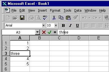
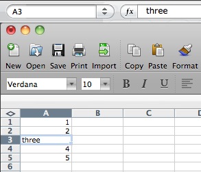
The individual elements of a spreadsheet are called cells. A cell is identified by its column (one or two letters) and row (a number); thus the cell in the upper left corner (highlighted when you started Excel) is named A1. The highlighted cell is called the active cell.
Cells can contain numbers or text, and their values can be set by what you type into them, loaded from files or the Internet, or computed by a formula that derives a value from the values of other cells.
Time to do some experimenting.
You can change the format of cell data by "Format | Cells", and then select "Number" to set the numeric display, "Alignment" to control centering, "Font" to set size and color, and so on. The most common reason to adjust cell format is to cause data to be treated as numeric and displayed with the same number of significant digits, or to define the format for data that represent dates. You can instead put text in cells to serve as headings for columns or rows; text can be set in various sizes and fonts as well.
You can use commands under "Edit" to clear cell contents entirely. In all of these, you can select a single cell, a group of cells, one or more entire rows, or one or more entire columns; the action applies to the selected range.
To insert an additional row or column, highlight the row or column before which you want to insert, then use the "Insert" menu.
A formula is typed into a cell just like data except that the first character must be an equals sign =. To experiment with this:
A further experiment:
It takes a lot of typing to enter data values and formulas this way, so Excel provides some convenient shortcuts.
Finally,
Excel, like Word, uses Visual Basic as a scripting language. All of Excel's myriad capabilities (including anything you can do with keyboard and mouse) are accessible from VB code. This can be used to organize much more complicated computations than would be feasible with simple formulas in cells, to tailor the interface for specific purposes, and to access all of the repertoire of other components on Windows. And of course the bad news is that spreadsheets can be just as much carriers of VB-based viruses as Word documents, so you should run Excel with macros disabled by default. (All such things are somewhat different for macOS Excel, and different again for other spreadsheets.)
We won't pursue any of this further, but if you want to explore, VB is waiting for you: Tools / Macro / VB Editor.... One of the neatest features is that you can turn on the "macro recorder"; this will record subsequent actions you perform and convert them into the equivalent VB code. It's a very effective learning tool and a valuable complement to the manual.
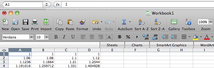
Your task is to make a spreadsheet that shows how good the approximation is and find the place where the ratio first becomes greater than 2.
|
Do this with as little typing and as much use of Excel's extension feature as possible; you can probably do it by typing no more than two or three rows and then extending them. Your table should look like this when done, except that it will have more rows, more data in the graph, a title and axis labels, and a highlighted row towards the end:
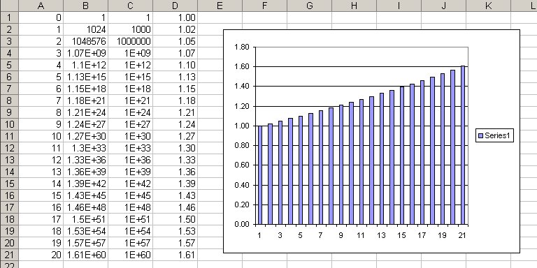
Notice that the approximation gets worse at worse than linear rate. To see just how fast it is getting worse, click on the chart, then select Add Trendline from the Chart menu or by right-clicking. Pick the trendline that gives the best fit to the data.
In this lab, you will be using a new sheet for each part, each with its own name. For this part,
|
You'll be updating this file throughout the lab, so be sure to save regularly.
We've talked about "the rule of 72", a handy rule of thumb that is used to make quick estimates of how fast interest or investments compound. If you invest a hundred dollars now at 10% per annum (assuming you could do that well!), at the end of a year it will pay ten dollars of interest. That gives you $110; if you invest that for the second year at the same 10%, at the end of two years, you'll have $121. Eventually, after about 7 or 8 years, you'll have $200; your money will have doubled.
The rule of 72 tells you how to estimate the doubling time approximately: divide 72 by the interest rate, and that's the number of periods. So at 10% per year, the doubling time is about 7.2 years. If the interest rate is only 6%, the doubling time is about 12 years. Of course, you can turn it around: divide 72 by the number of periods and it gives the interest rate. Consider Moore's Law, that the capacity of semiconductor chips doubles every 18 months. By the Rule of 72, we see that capacity is compounding at about 72/18 = 4% per month.
The approximation isn't perfect, but it's pretty accurate for the kinds of percentages found in daily life for home mortgage interest rates, bond interest, car payments, tuition increases, and so on. If you want to see how it works, Google provides lots of hits; this one is pretty comprehensive.
Your task is to make a spreadsheet that shows how good the approximation is for a variety of interest rates.
|
Try to do this with as little typing and as much use of Excel's extension feature as possible. Your table should look like this when done:
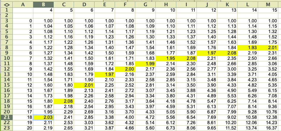
The rule shows further doublings as well; for instance, note that at 8%, one doubling takes 9 years, and the next takes another 9 years -- that is, 18 years doubles twice, or a factor of four. Check some of the other entries for similar consistency.
For example, A1:A10 describes a column range 10 cells high but only one cell wide. The range B2:K2 represents a row of 10 cells starting at B2, and A1:J10 represents an array of 100 cells, 10 by 10, that starts in the upper left corner. As a special case, A2:A2 is a range that consists of a single cell, and that can be abbreviated to the familiar A2.
Excel provides more complicated ranges, but for the most part, simple rectangular arrays are all we need. It is also possible to name a range, which is easier to understand and refer to in a big spreadsheet; we won't be using that facility here.
The range notation gives us a way to specify an arbitrarily large group of cells, and thus write out computations more compactly and clearly. For instance, it's impractical to type a formula like =A1+A2+A3+... if there are more than a few terms in the summation; a range is a lot easier.
Excel provides a great number of mathematical functions that perform operations over a range of cells. The simplest of these is sum, which adds up the numbers in a range: the formula =SUM(range) produces the sum of the values in the cells in the specified range.
What happens if you need another row or column, because your data set has expanded? If you insert a row or a column within a range, Excel is pretty clever about guessing what you mean, and will extend the formula for you. But if you add a row or column at one end of the range, Excel isn't sure what you had in mind, and doesn't change the formula. Verify this behavior:
Have you ever wondered how your performance in a course will affect that most crucial of all numbers, your GPA? Here's your chance to find out while learning something useful.
Make a new sheet called GPA. Enter the data for letter grades and their corresponding numeric value in A2:A13, as in the first two columns of this example:
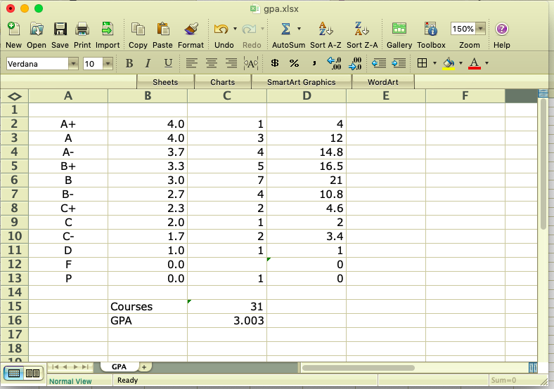
Column C is the number of courses in which you got a particular grade; for example, this person got 1 A+, 3 A's, 4 A-'s, and so on. Column D computes how much each grade contributes to total score, C15 is the number of courses and C16 is the GPA. You have to figure out the formulas for Column D and cells C15 and C16. The GPA should be displayed with exactly 3 digits after the decimal point.
You should be able to enter any hypothetical set of grades to compute a GPA. Note that a P counts as a course but does not affect your GPA. An F does not count as a course and does not affect your GPA. Let's hope you never get an F, but do test your spreadsheet for this case anyway. (This is a somewhat simplified version of the computation on the registrar's site.)
Once you have it all working,
|
The raw data file looks like this:
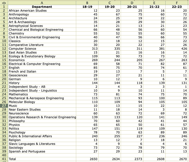
Your task is to download this file, then sort it and make charts (graphs) in a variety of ways, using functions like max, min, and others.
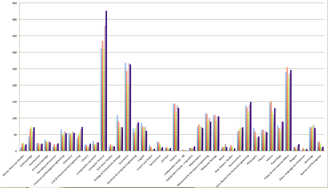
As you can see, COS is the big dog in this group. Sort the data on column F, the enrollments for 2022-23, in descending order so you can see who the smaller ones are. Add a proper title, proper identification of the colors, and so on. Make any other adjustments you like to make the chart as clear as possible.
Once you're comfortable with that, add a new column G that computes the average enrollment over the five years for each department, and displays the same graph but sorted on the new column, so that the departments are listed in descending order of average size for the past five years.
|
It's always nice when others recognize one's true greatness, as US News and World Report has done by ranking Princeton as the top national university every year since 2000, perhaps by coincidence the year I joined the faculty. (Lamentably they made an error in 2008 by ranking us second, but that hasn't happened since.) Here's the top of the list for 2024, published in September 2023.


A couple of years ago, Columbia used to be in second place. It turns out that Columbia had been fudging the numbers, however, and after a devastating article by one of its own faculty members, had to withdraw some of the data. It was dropped to 18th place, but this year has risen to 12th. Here's part of the story.
How are these rankings really determined? And how much do they really mean?
US News reveals a bit about their methodology. Basically, they collect data on a variety of factors for each school, weight the factors according to how important they seem, and then sort the results. For example, "graduation and retention rates" count for 21% of the score, "social mobility" for 11%, "peer assessment" for 20%. Alumni giving percentage, where Princeton is sure to win big, has been dropped this year.
There are several problems with these ranking schemes: the data itself can be flaky, the weighting factors are arbitrary, and, as Columbia did, schools themselves might try to game the system. In this lab, we'll accept the data values, however flaky they might be, and focus on the weighting factors.
The file usnews.xls contains some carefully fiddled data and a set of weights, loosely based on data from many years ago. Many factors have been unceremoniously dropped and a few data values have been adjusted, so don't read anything into this, especially not about the merits of individual schools then or now. Here is the display:
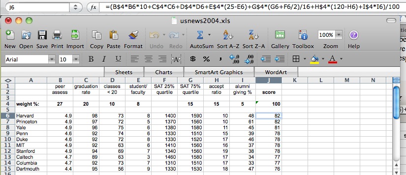
The first two rows show the factors, and the fourth row gives weights that sum to 100% (cell J4). The range J6:J15 shows the computed scores. The formula box shows the formula being used to compute J4; subsequent rows have the same formula except for cell references. A couple of factors are combined (SAT) or complemented (acceptance ratio, since a low acceptance ratio is deemed better than a high acceptance ratio.
Your task is to find several sets of non-negative weights that will rearrange the schools in various ways. Note that the weight percentages in B4:I4 must sum to 100.
|
Give this a decent effort, not just the first obvious thing that happens to make a change. You should also experiment with Excel's sorting capabilities here; at the end, you should be able to sort the schools by any combination of factors, for example, by decreasing reputation score and within that by increasing acceptance rate.
At this point you should have a workbook with five sheets: Power2, Rule72, GPA, Majors, Rank. Check through them to make sure they look right.
Be sure to save your work as lab4.xlsx somewhere safe. This is your backup in case something goes wrong with the submission or your computer. You could mail a copy of lab4.xlsx to yourself, as another backup. Make sure that it arrives OK, that the attachment is about the right size, etc.
If you used Google Sheets or another Excel alternative, convert your spreadsheet into Excel's .xlsx format. Make sure that it is named lab4.xlsx before you upload it to Gradescope.
When everything is working, then upload lab4.xlsx to Gradescope for Lab4. Do not put this lab on cPanel.
Comment on Hacker News, August 2022: "Excel is a glorious tool which welcomes all, the savvy and the unskilled but imaginative newbies alike. There is something about all those little cells that presents an itch everyone wants to scratch, and you just know that for some, that scratching is going to produce something akin to a spreadsheet version of gangrenous melanoma."